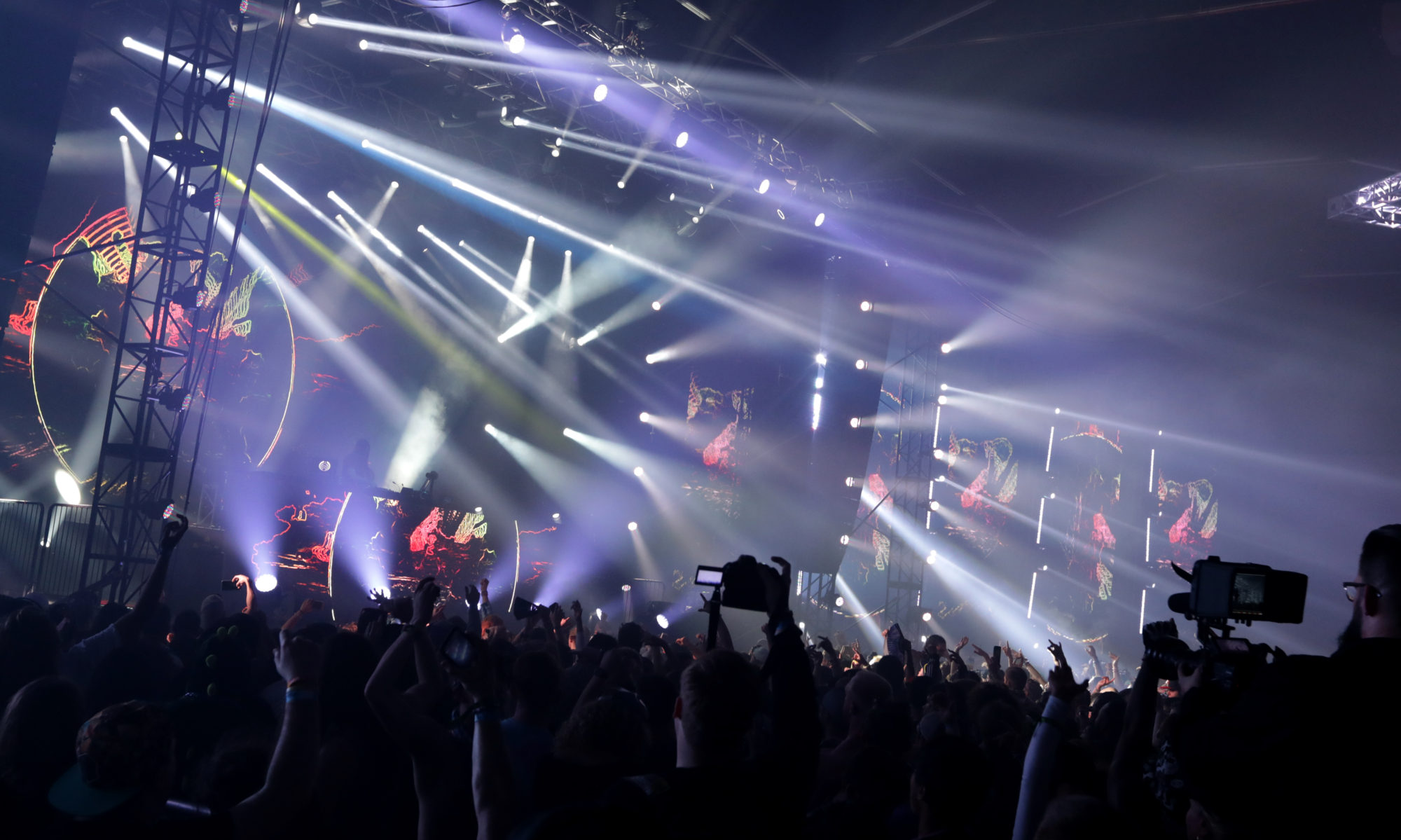
This shot was supposed to have a summertime “night on the town” sort of feel. I thought I’d share the actual image, followed by the way it ran in print. This will give you an idea of what art directors and designers will do with your photos. You can see a lot of extra space is given to the layout people, so they can crop in, combining the photo with the text.
After:


